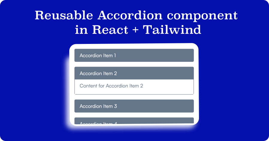
In web development, Accordions or collapsible panels are interactive UI components that allow users to expand and collapse sections of content on a webpage.
Accordions typically consist of a set of headings or titles, and when clicked, reveal the associated content. Accordions provide a compact and organized way to display large amounts of information in a compact manner. They enhance the user experience by allowing users to focus on specific sections of interest and avoid overwhelming them with excessive content.
Accordions can be easily implemented using HTML, CSS, and JavaScript, making them versatile and widely used elements in web design.
We can easily create the accordions using HTML Details and Summary tags without using any javascript.
In this article, we will learn how to create a reusable Accordion component in React + Tailwind.
If you do not have the basic setup, visit the official Tailwind documentation for Installing Tailwind CSS with Create React App.
Assuming we already have our React app set up with Tailwind CSS, open the code editor, and let's get going.
Open src/components and create a new component Accordion.jsx
import React from 'react'

export default function Accordion() {
  return (
    <div>Accordion</div>
  )
}
We have just created a basic component for our accordion. Next, let's create a basic structure to show the title and content for our accordion. Here is the updated Accordion.jsx component
import React from "react";

export default function Accordion() {
  return (
    <div>
        <div onClick={() => console.log("Title clicked")}>
            Accordion title
        </div>
        <div>
            Accordion content
        </div>
    </div>
  )
}
Now let's move to add tailwind classes to design our accordion a bit and state setup for our accordion. We need to open the accordion when clicked. The Accordion component uses the useState hook to keep track of the active accordion item's index.
For this we need to update the code -
import React from "react";

export default function Accordion() {
    const [activeIndex, setActiveIndex] = useState(null);

    return (
        <div>
            <div
                className="accordion-header bg-gray-100 cursor-pointer px-4 py-2"
                onClick={() => console.log("Title clicked")}
            >
                Accordion title
            </div>
            <div className={`accordion-content bg-white px-4 pb-4 pt-2`}>
                Accordion content
            </div>
        </div>
    )
}
Notice that, we have our initial state set to null for activeIndex. This means by default, all the accordion items will be closed. If you want to open the first accordion item to be opened you can replace the null to 1 in the useState hook.
Great. Now before moving forward, let's create a dummy accordionData that will have all the titles and content for each accordion item. We will render all the items and content using the map function to loop through the accordion data and render it in our accordion. Here is the updated code -
import React from "react";

export default function Accordion() {
    const [activeIndex, setActiveIndex] = useState(null);

    const accordionData = [
		{
			title: "Accordion Item 1",
			content: "Content for Accordion Item 1",
		},
		{
			title: "Accordion Item 2",
			content: "Content for Accordion Item 2",
		},
		{
			title: "Accordion Item 3",
			content: "Content for Accordion Item 3",
		},
		{
			title: "Accordion Item 4",
			content: "Content for Accordion Item 4",
		},
		{
			title: "Accordion Item 5",
			content: "Content for Accordion Item 5",
		},
	];

    return (
        <div>
          {accordionData.map((item, index) => (
				<div
					className="border-gray-300 mb-4 rounded border"
					key={index}
				>
					<div
						className="accordion-header bg-gray-100 cursor-pointer px-4 py-2"
						onClick={() => console.log("Title clicked")}
					>
						{item.title}
					</div>
					<div
						className={`accordion-content bg-white px-4 pb-4 pt-2 ${
							activeIndex === index ? "block" : "hidden"
						}`}
					>
						{item.content}
					</div>
				</div>
			))}
        </div>
    )
}
We are just a few steps away to make our accordion functional. All we need is to create a handleClick function that will be responsible for toggling the active item based on the clicked accordion title index. Do not forget to pass the index in handleClick function.
We already have modified the content section above and we just need to toggle the content based on an active index of the accordion items.
Here is our handleClick function -
const handleClick = (index) => {
	setActiveIndex(index === activeIndex ? null : index);
};
Let's implement this in our Accordion.jsx and updated and final code as below -
import React, { useState } from "react";

export default function Accordion() {
	const [activeIndex, setActiveIndex] = useState(null);

	const handleClick = (index) => {
		setActiveIndex(index === activeIndex ? null : index);
	};

	const accordionData = [
		{
			title: "Accordion Item 1",
			content: "Content for Accordion Item 1",
		},
		{
			title: "Accordion Item 2",
			content: "Content for Accordion Item 2",
		},
		{
			title: "Accordion Item 3",
			content: "Content for Accordion Item 3",
		},
		{
			title: "Accordion Item 4",
			content: "Content for Accordion Item 4",
		},
		{
			title: "Accordion Item 5",
			content: "Content for Accordion Item 5",
		},
	];

	return (
		<div className="container mx-auto">
			{accordionData.map((item, index) => (
				<div
					className="border-gray-300 mb-4 rounded border"
					key={index}
				>
					<div
						className="accordion-header bg-gray-100 cursor-pointer px-4 py-2"
						onClick={() => handleClick(index)}
					>
						{item.title}
					</div>
					<div
						className={`accordion-content bg-white px-4 pb-4 pt-2 ${
							activeIndex === index ? "block" : "hidden"
						}`}
					>
						{item.content}
					</div>
				</div>
			))}
		</div>
	);
}
Great. This is how we can easily create a reusable Tailwind and React component.

