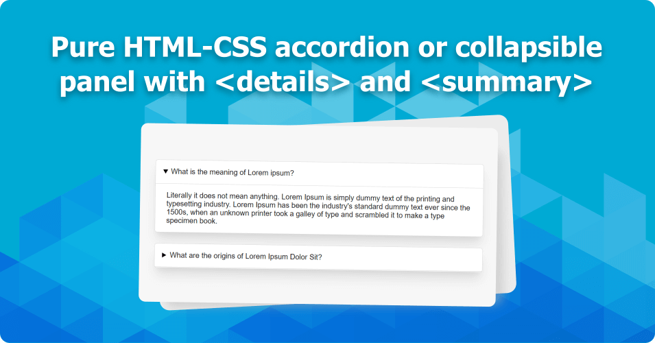
Collapsible panels or accordions have been an important part of the UI experience for a long time.
In this article, we will explore HTML5 <details> and <summary> tags to create the same with and without JavaScript or JQuery.
Accordions or collapsible panels are generally used to hide and show a large amount of content under a title or heading.
You must have used this Bootstrap accordion in any of your projects. 👇
Create an accordion panel with JQuery (is it still relevant?)
Before diving into our pure HTML accordion, let's see this JQuery collapsible panel example.
<div class='row'>
  <h3 class='header'>What is the meaning of Lorem ipsum?</h3>
  <p class='content'>
     Lorem ipsum dolor sit amet, mauris montes orci laoreet, commodo
     sed ut neque et, aptent sapien ipsum rhoncus purus semper, vehicula mauris
     sed eget sagittis.
  </p>
</div>

<div class='row'>
  <h3 class='header'>What is the meaning of Lorem ipsum?</h3>
  <p class='content'>
     Lorem ipsum dolor sit amet, mauris montes orci laoreet, commodo
     sed ut neque et, aptent sapien ipsum rhoncus purus semper, vehicula mauris
     sed eget sagittis.
  </p>
</div>
A little styling to make it look good.
body {
  font-family: "Roboto", sans-serif;
  background: #f7f7f7;
}

.row {
  .header {
    border: 1px solid #16acff;
    padding: 10px;
    background: #f0f0f0;
    margin-bottom: 2px;
    cursor: pointer;

  }

  .content {
    background: #ddd;
    padding: 10px;
    margin: 0
  }
}
Using jquery to make it work.
$(document).ready(function() {
  // hide all div with class .content by default
  $('.row .content').hide();

  // when the class .header is clicked,
  // toggle div with class .content
  $('.row .header').click(function() {
    $(this).parent().find('.content').slideToggle(500);
  });
});
Here is the JQuery accordion demo on JSFiddle
You can add an open/close indicator icon and for that, you have to write a few more lines. Let it go 🥱 and move to the main topic. 👇
Create an accordion panel with HTML and CSS only
HTML5 <details> and <summary> Tag
The markup
<div class="faq">
  <details open>
    <summary>What is the meaning of Lorem ipsum?</summary>
    <div>Literally it does not mean anything. Lorem Ipsum is simply
        dummy text of the printing and typesetting industry. Lorem
        Ipsum has been the industry's standard dummy text ever since
        the 1500s, when an unknown printer took a galley of type and
        scrambled it to make a type specimen book.</div>
  </details>
  <details>
    <summary>What are the origins of Lorem Ipsum Dolor Sit?</summary>
    <div>
      Contrary to popular belief, Lorem Ipsum is not simply random text.
      It has roots in a piece of classical Latin literature from 45 BC, making
      it over 2000 years old. Richard McClintock, a Latin professor at
      Hampden-Sydney College in Virginia, looked up one of the more obscure
      Latin words, consectetur, from a Lorem Ipsum passage, and going through
      the cites of the word in classical literature, discovered the undoubtable source.
    </div>
  </details>
</div>
As you can see we have used only <details> and <summary> tag to create the markup and it's working nicely.
Notice that the <summary> (label) is wrapped inside <details> (Additional content) tag. When the label is clicked it toggles the details.
A small triangle also comes with it to indicate the open/closed status of the panel.
We can customize the default design with CSS. So let's add some style.
body {
  font-family: "Roboto", sans-serif;
  background: #f7f7f7;
}

.faq {
  padding: 1.5rem;
  details {
    border: 1px solid #ddd;
    background: #fff;
    margin-bottom: 1.5rem;
    border-radius: 0.35rem;
    box-shadow: 0 20px 25px -5px rgba(0, 0, 0, 0.1),
		0 10px 10px -5px rgba(0, 0, 0, 0.04);

    summary {
      cursor: pointer;
      padding: 1rem;
      border-bottom: 1px solid #ddd;
    }
    div {
      padding: 1rem 1.5rem;
    }
  }
}
.. and boom! Our pure HTML-CSS accordion or collapsible panel is ready. Here is the JSFiddle Demo
This collapsible panel is completely accessible and works with tab key to navigate and spacebar to toggle. 💪

